Reconciling the Cult of “Pretty”
“I pulled this doc together. Can you take a look at it and make it pretty?”
“Go work your magic on these pages–make it pretty.”
“I’ll tag you once I’ve scraped together the content, then you can go make it pretty.”
When you’re a creative the word “pretty” is often used to describe the nature of your work and to call you to task. The word stings for a brief moment as you smile, nod, and accept your role in the grand scheme of your organization. Yet, you’re there in the middle of a conversation, translating business needs into a brand experience that is both elevated and aligned, and your work as an experienced visual strategist, solutionist, and trusted partner just translates to “pretty?”
Let’s dissect that last statement:
“You’re in the middle of a conversation…”
You are present and actively involved in positioning the project. You are able to collaborate, engage— garner a deeper understanding of the objectives and the audience, ask questions, propose alterations, suggest where to build emphasis, and make connections between business activities, your brand’s value, trends, and information internally and across your broader market— all ultimately contributing to more effective means of communication for any given element of the project.
“…translating the business needs into a brand experience…”
To be a translator or an interpreter means that you are in the unique position of transformation. You take one form of language and express it in another. You understand both the art and science of visual design and the unique brand positioning of your business. You effectively build the strategic marriage between both your business’s purpose and your business’s brand. Design and visuals are experienced by the viewer— your role determines how that information meets its audience: how it’s read, seen, and interpreted. Your work is fundamental in delivering messaging. Your work builds the visual thread that guides your targets through your brand’s story— connecting the problem to the solution.
“…that is both elevated and aligned.”
You don’t just interpret the needs of the project, you align it to the look, feel, and voice of your brand standard. You make determinations on what constitutes the brand, what is misaligned, and what boundaries you need to challenge to build a successful outcome. You actively implement and guide your business through those decisions over the course of a project, be it as small as how a statement is worded or the entire organization of a full set of information.
Combine all these factors and you get to the core of the definition of what "pretty" actually means in the mouth of a stakeholder. The word ultimately suggests the recognition of creative and brand expertise contributing to the viability of a project and the perception of a brand at-large, but it also shows a lack of understanding of the architecture and the language to effectively translate needs and expectations.
While that gap may never be bridged entirely, bringing forth a common brand language requires the careful engineering, distribution, and education of key brand concepts, elements, and resources to imbue your stakeholders with a greater understanding of their brand and the easy-to-use tools to execute daily documents. A creative’s job is not necessarily to touch every document that leaves the confines of the business, but to thoughtfully build agility into the brand through resource activation. This is not only key to making your brand language internally comfortable and commonplace but is necessary in creating seamless brand unity and recognition to external audiences across all touchpoints they encounter.
Building an effective resource library is not as simple as shoving a load of files onto a brand microsite or shared drive. Engineering a useful library experience requires understanding the needs for brand application among its pool of user types and making key resources accessible and instructional. There will be power users, but every person that places your logo on a document is not going to consult the full brand standard and knowingly adhere to aspects of the brand that are second nature to creatives like clear space rules, the negative versus positive application, or the knowledge to use the correct file type per application.
Supporting every user's needs and experience in-house requires:
Providing an intuitive structure of your brand resources library.
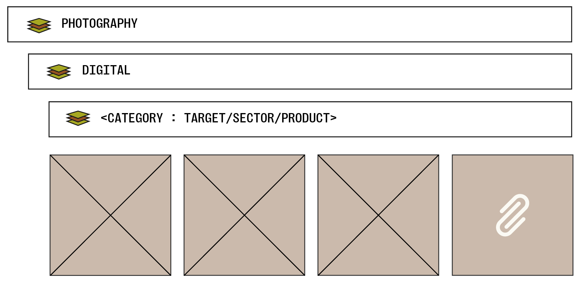
Beyond your homepage and search bar, separating your resources into an accessible structure that allows users to quickly flow to the assets they need. This may include recognizing target sectors, products, or other important aspects your general users may be searching for regularly within the structure itself and crosslinking where necessary.
Consistently tagging files, especially adding business friendly keywords (and distributing a defined list) to the metadata of photos, allows searchers to quickly drill down to what they need in a rich library.

Using naming conventions that further enhance the structure.

This is inclusive of using accessible, plain language and foregoing more designer-forward labeling. For instance, dropping more technical terminology like “CMYK” or “RGB.” While a change like this might not feels utilitarian and barely technical at a glance, does every user immediately equate RGB to screen-only and CMYK to print-only? In instances like this, favor more direct language that guides all user proficiencies such as “print” and “digital.”
Packaging bite-size files of brand instructions with resources to guide proper use.
Armed with an understanding of what brand standards need to be applied by your business broadly versus what needs technical application, break up your brand guide into more approachable guides of application and package these with the resource files themselves. While not guaranteeing the proper application, as you can’t force someone to read anything about logo application or color usage, adding these additional failsafes increases the likelihood of successful adherence and education. Take this opportunity to simplify designer terminology that exists within the standard in favor of your least brand proficient user.
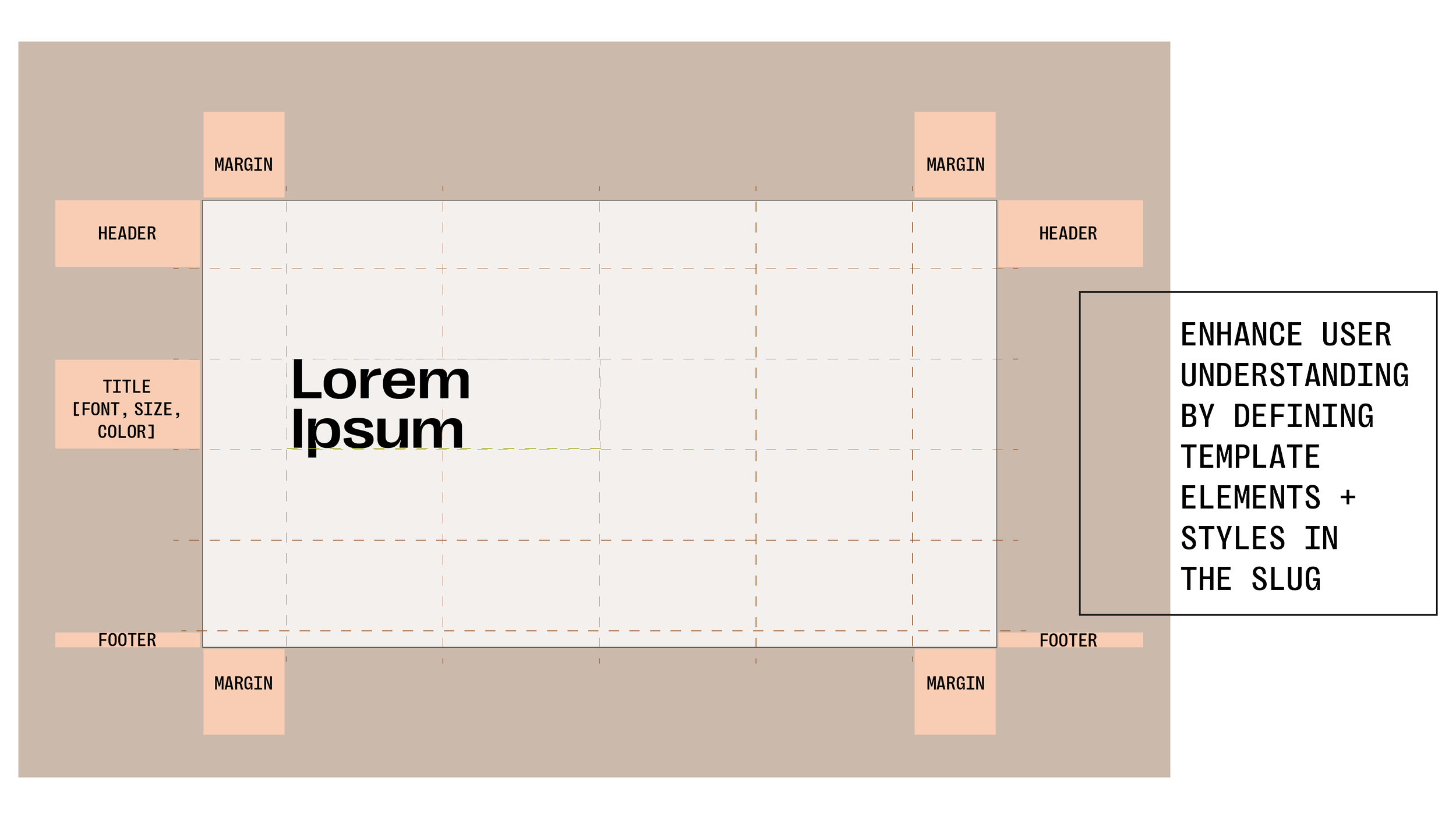
Demystifying business templates
As easy as we believe our templates to be, there’s still vast room for error. Guide users with additional elements by adding instructional tags to the margins of slides and mini, all-user friendly style guides to the front of documents. Enhance these resources with links to your libraries. Just like creating bite-sized guides, adding these instructions will not prevent someone from immediately disregarding the guides or even adhering to them (since everyone at one point or other believes their need is the exception), but doing so builds a richer resource that allows your creative teams to focus on bigger projects.